Design Process - BK ICE
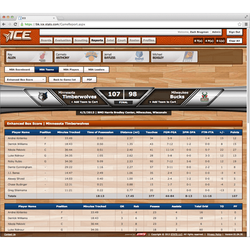
Summary The BK ICE project was built from scratch and at the beginning there was little data that had been integrated into the application. With the lack of data and information, stakeholders requested the application to have a very heavy and skeumorphic design to appeal to early adopters. As I took over as the lead designer on the project, I pushed for a redesign to improve the visual aesthetic and performance.
Usability and Performance
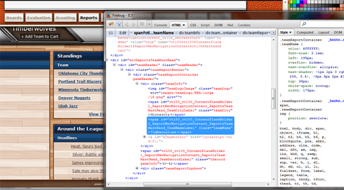
As a redesign became more of a possibility, I began experimenting with CSS only changes. As I became more and more familiar with the application's code structure, it became evident that there would need to also be some structural changes to improve usability and performance. Some of the initial requirements were as follows:
Acceptance Criteria
- Site performance does not get worse (speed)
- PDF functionality still works
- Navbar highlights which tab the user is on in a more obvious fashion
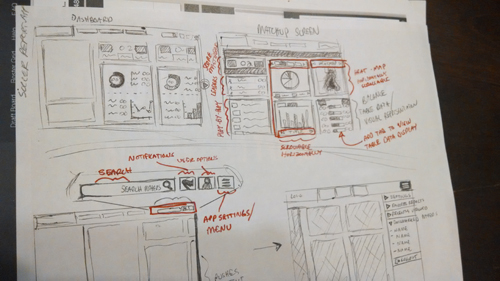
Sketches I began the process of restructuring elements by creating sketches of a general layout of elements. There were a lot of shared elements, but a lot of unique elements to consider.
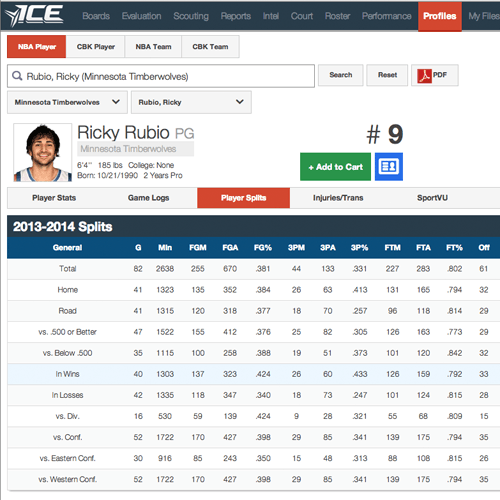
Improving Performance The BK ICE application has a lot of filters and search options. The original design of dropdowns and search controls were built using a jQuery library, but as the application grew the jQuery became very troublesome. Stakeholders requested that the application keep the same process of accessing information, but I was able to convince them of creating HTML/CSS dropdowns and search controls. The new dropdowns and search controls do not have the prior image dependency and are displayed immediately upon page load.
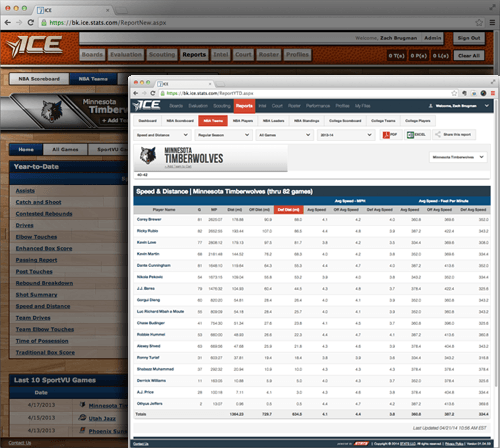
Applying a Flat Design The prior design of the application included a lot of image dependencies, for example: the basketball court background, images for the button designs, title bar images, etc. Instead of having as many image dependencies in the new design I utilized a flat design approach. Using CSS gradients and styles, I was able to emulate some of the same treatments that were in the old design. With the new CSS styles, the aesthetic of the page can be immediately loaded and does not require as large of files.
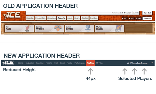
Redesiging Application Header The previous application header containing navigational elements was unnecessarily large, resulting in the content of the page being pushed down below further than it needs to be. The application also uses a way of saving selected players in a similar way a shopping cart works on ecommerce sites, which also pushed content down. In the redesign of the header, I proposed moving this information into an easily accessible dropdown in the header. I also removed elements that were not being utilized very frequently and included them in the newly created dropdown. To cater to tablet users, I kept the touch area of the navigational elements to the industry standard 44 pixels in height/width.
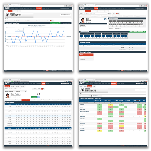
Overview For this redesign, I acted as the sole designer and controlled all CSS and structural changes. I was in constant communication with developers while they also did performance updates so we could collaborate without stepping on each others toes. While working in an agile development environment with sprints lasting 3 weeks or so, the entire redesign process lasted nearly 3 sprints.