Design Process - NFBC Mobile App
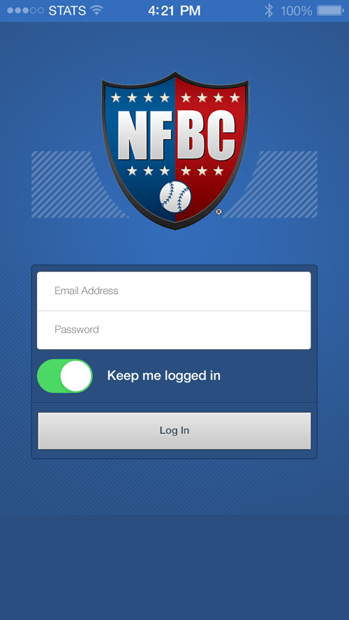
Summary This was a redesign of the iOS mobile application for the NFBC game. NFBC is a fantasy baseball platform consisting of various high-stakes games. The design needed to cater to the various games and a way for a user to navigate between their teams and leagues. I was responsible for the design of the screens, while the development was done by our Sports Interactive team. The Sports Interacitve team is based in India so the communication between myself, stakeholders, and them needed to be very precise and constant.
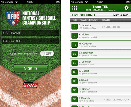
Old Design The old version of the NFBC application was very archaic and I was responsible for creating a fresher aesthetic. I applied a more modern, flat aesthetic to the application to allow for users to navigate the game more easily.
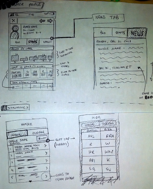
Low-Fidelity Wireframes I first created low-fidelity wirefames in the form of sketches.
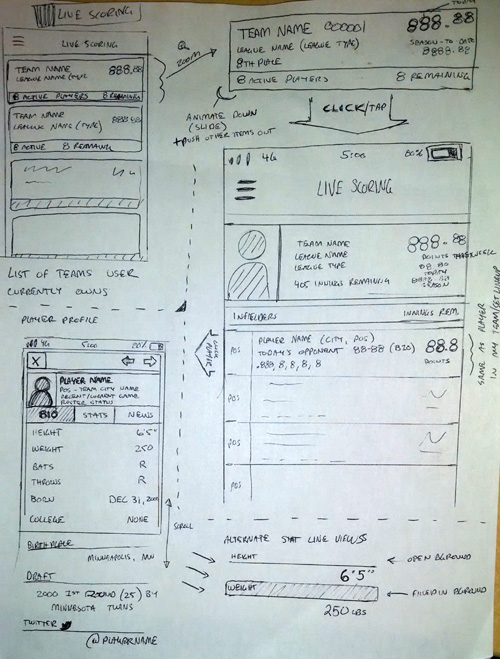
Low-Fidelity Wireframes I introduced an off-canvas menu to allow the user to easily navigate between teams and leagues, as well as access important pages unique to the fantasy game they were participating in.
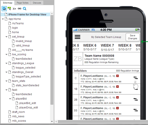
Axure Prototype
After completing sketches of primary pages and determining a high-level flow of the game I created a high-fidelity prototype using the Axure tool. The use of Axure allows stakeholders to more clearly understand the flow of pages and visualize the user interactions.
NFBC Mobile Axure Prototype
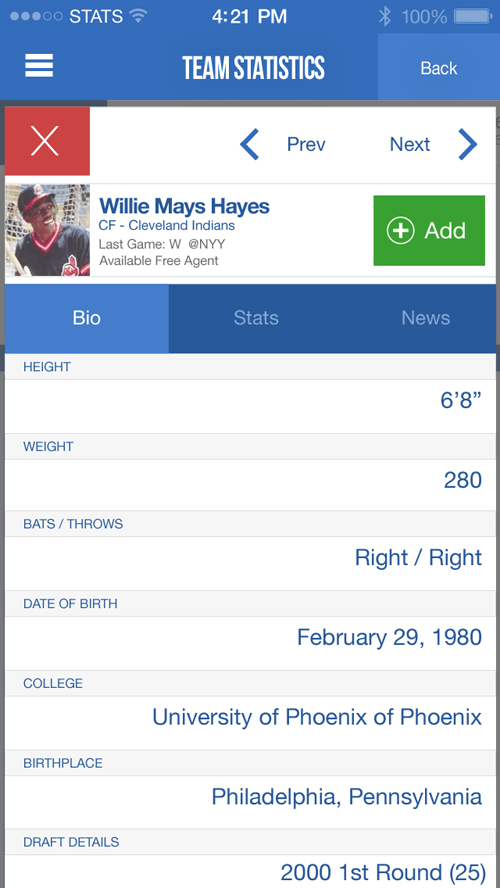
Screen Mocks
After receiving sign-off from stakeholders for the Axure prototype, I began creating the mocks. There was a need to create many mocks to assist the Sports Interactive team in understanding how each page would look and how the user would navigate the application.
View more examples of the screen mocks here
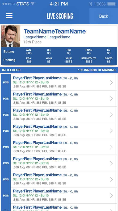
Development Once the prototype and mocks were completed and handed off to the Sports Interactive team, I was available to them for further assistance developing the application. There is also plans to create an Android version of the application in the future.